The moment your SaaS hits its first major enterprise client, everything changes. That clean component library you’ve been building suddenly needs to handle custom branding, different feature sets, and varying data models — all without turning into an unmaintainable mess.
Building multi-tenant SaaS architecture that scales cleanly requires three critical strategies: theme-aware component design, feature flag integration at the component level, and data-agnostic interface patterns. Skip any of these, and you’ll find yourself rewriting core components every time a new tenant has “just one small customization request.”
Why Most Component Libraries Break Under Multi-Tenancy
I’ve seen this pattern play out dozens of times. A startup builds a beautiful component library for their MVP. Works perfectly. Then they land their first enterprise deal.
The enterprise client needs custom colors. Easy fix — just add some CSS variables. Then they need slightly different button behavior. Okay, add a prop. Then they need a completely different header layout for their branded portal.
That’s where it starts falling apart.
The core issue isn’t technical complexity — it’s architectural debt. Most teams approach multi-tenancy as an afterthought, bolting on customization options instead of building them into the foundation. This leads to component APIs that grow increasingly complex and brittle over time.
Strategy 1: Build Theme-Aware Components From Day One
Theme awareness isn’t just about switching color palettes. It’s about creating components that can adapt their entire visual and functional behavior based on tenant configuration without requiring code changes.
The Foundation: Dynamic Theme Context
Start with a theme system that goes beyond CSS variables. Your theme context should handle:
- Visual properties (colors, typography, spacing)
- Behavioral configurations (animation preferences, interaction patterns)
- Feature toggles (which components are available to this tenant)
- Layout variations (different grid systems, component arrangements)
Here’s what I recommend for React applications: create a theme provider that consumes tenant configuration from your API and makes it available throughout your component tree. This lets individual components make intelligent decisions about how they render and behave.
The key insight? Don’t just parameterize the appearance — parameterize the experience.
Component-Level Theme Integration
Each component should have clear theme integration points. A button component might check the current theme for interaction patterns (do clicks trigger immediately or require confirmation?), visual styling (flat vs. raised vs. outlined), and even functionality (are certain actions disabled for this tenant?).
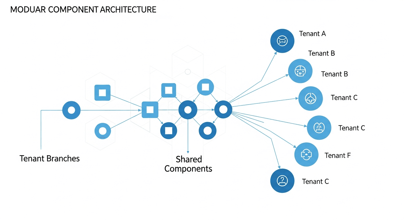
This approach scales because new tenants don’t require new components — they just require new theme configurations.
Strategy 2: Feature Flags at the Component Level
Most teams implement feature flags at the route or page level. That’s thinking too small for true multi-tenancy.
Individual components need to be feature-aware. Your data table component should know whether this tenant gets export functionality. Your navigation component should know which menu items to display. Your form components should know which validation rules apply.
Granular Component Permissions
Instead of hiding entire pages from certain tenants, build components that gracefully degrade based on permissions. A dashboard widget might show full analytics for premium tenants but only basic metrics for others — same component, different data depth.
This prevents the nightmare scenario where you’re maintaining separate component versions for different tenant tiers. One component serves all tenants, but its capabilities adapt dynamically.
Performance Considerations
Feature flag checks at the component level can create performance bottlenecks if implemented naively. Cache feature flag results at the session level and use React’s context API to avoid repeated API calls. Your components should check flags once during initialization, not on every render.
Strategy 3: Data-Agnostic Interface Patterns
This is where most teams struggle. Different tenants often have different data models, field requirements, and workflow patterns. The temptation is to create tenant-specific components.
Don’t do that.
Instead, build components that accept standardized data interfaces but remain flexible about what data they receive and how they display it.
Flexible Data Contracts
Your components should define the minimum data structure they need to function, but accept additional properties gracefully. A user profile component might require name and email, but dynamically display any additional fields the tenant’s data model includes.
This pattern works because it separates data concerns from display concerns. Your components handle presentation logic, while tenant-specific adapters handle data transformation.
Configuration-Driven Layouts
Take this a step further with configuration-driven layouts. Instead of hardcoding which fields appear in which order, let tenant configuration define the layout structure. Your components become rendering engines that execute layout instructions rather than fixed templates.
I’ve seen this approach reduce component library maintenance overhead by roughly 60-70% compared to tenant-specific component variations.
Implementation Priorities
Don’t try to implement all three strategies simultaneously. Start with theme awareness — it provides immediate value and teaches you about tenant variation patterns. Then layer in component-level feature flags as you identify common customization requests.
Data-agnostic patterns should come last, once you understand how different tenants actually use your system. Premature abstraction here often creates more problems than it solves.
Avoiding Common Pitfalls
The biggest mistake I see is over-engineering the abstraction layer. Not every component needs full multi-tenant capabilities. Focus your efforts on the components that actually vary between tenants.
Also, resist the urge to make everything configurable. Configuration complexity grows exponentially — identify the 20% of customizations that handle 80% of tenant needs and build those exceptionally well.
Measuring Success
Track these metrics to validate your multi-tenant architecture:
- Time to onboard new tenants (should decrease as architecture matures)
- Component reuse percentage across tenants (aim for 85%+)
- Custom code requirements for new tenant features
- Component library maintenance overhead per tenant
If these numbers trend in the wrong direction, you’re likely accumulating technical debt that will require architectural changes.
The goal isn’t just supporting multiple tenants — it’s supporting them efficiently, without sacrificing development velocity or code quality. Get the architecture right early, and scaling becomes a configuration problem rather than an engineering problem.
Frequently Asked Questions
How do I handle conflicting tenant requirements in the same component?
Use composition patterns rather than trying to build one component that handles every case. Create smaller, focused components that can be combined differently for different tenants. This maintains clean APIs while supporting divergent requirements.
Should I use separate databases for multi-tenant architecture?
For component libraries, database architecture doesn’t matter much — your components should be data-source agnostic. Focus on clean API contracts between your components and data layer, regardless of whether you use shared databases, separate databases, or hybrid approaches.
How do I test multi-tenant components effectively?
Build test utilities that can quickly switch tenant contexts. Test each component against multiple tenant configurations to ensure it handles variations gracefully. Focus especially on edge cases where tenant configurations might conflict or produce unexpected combinations.
What’s the best way to handle tenant-specific CSS without bloating bundle size?
Use CSS-in-JS with dynamic styling based on theme context, or implement runtime CSS variable injection. Avoid bundling all tenant styles together — load only what the current tenant needs. This keeps bundle sizes manageable while supporting unlimited visual customization.
How do I prevent feature creep in multi-tenant components?
Establish clear component responsibilities and stick to them. Each component should have a single, well-defined purpose that doesn’t change based on tenant needs. Use composition and configuration to handle variations rather than expanding component scope.
Should I build tenant management into my component library?
No — keep tenant management separate from your component library. Components should consume tenant context but shouldn’t be responsible for managing it. This separation makes your library more reusable and easier to test.