Most people assume the difference between a cheap-feeling website and a premium one comes down to better graphics or a bigger design budget. It doesn’t. The difference is psychological. Premium websites are engineered around how the brain actually works.
Three principles account for most of the gap between websites that feel high-end and websites that feel forgettable. Understanding why they work makes them much easier to apply.
Principle 1: The Halo Effect
The halo effect is a cognitive bias where a strong first impression in one area colors your perception of everything else. It was documented in 1920 by psychologist Edward Thorndike, and it’s one of the most powerful forces shaping how users experience your website.
Research from Google found that users form opinions about websites in as little as 50 milliseconds — before they’ve read a single word. That first impression is based entirely on visual signals: color, layout, density, typography. And here’s the critical part: that impression shapes how they interpret everything that follows.
If the hero section looks professional and considered, the brain assigns those same qualities to your products, your prices, and your credibility. Even if the rest of the site is only average, the positive halo carries users through it with goodwill. Conversely, a cluttered, low-contrast, generic-looking hero creates a negative halo. Now every subsequent section has to fight uphill against initial skepticism.
What this means in practice
The hero is not just the first section — it’s the most leveraged real estate on the page. The time spent obsessing over it returns disproportionate results everywhere else.
Before building a hero, answer one question: what is the single feeling a visitor should have in the first 50 milliseconds? Calm and trustworthy? Technically impressive? Bold and provocative? Build every element of the hero — typography, color, spacing, imagery — around that one feeling.
Common hero mistakes that trigger a negative halo: too many competing elements, low contrast text, generic stock photos, weak or cluttered typography, and too many CTAs fighting for attention. Cheap-feeling heroes don’t usually look bad in isolation — they feel bad because the brain reads the chaos as a signal of the business behind them.
Principle 2: Cognitive Load and Cognitive Fluency
The brain conserves energy. When faced with something complex or confusing, it works harder — this is cognitive load. When something is easy to process, it creates cognitive fluency: a feeling of smoothness that the brain interprets as quality, trustworthiness, and intelligence.
This is counterintuitive but well-documented. Studies have shown that people rate information presented in a clear, readable font as more credible than the same information in a harder-to-read font. The ease of processing becomes a proxy for the quality of the content itself.
Applied to websites: high cognitive load feels stressful and unprofessional. Low cognitive load feels premium. The way to reduce cognitive load is not to make things simpler in terms of content — it’s to make the visual presentation effortless to navigate.
The specific culprits
Competing elements. When multiple elements on a page have equal visual weight, the eye doesn’t know where to go. Every section should have one primary element that anchors it. Everything else should clearly subordinate to it.
Insufficient white space. White space is not wasted space — it’s a cognitive cue that signals confidence. A page that fills every pixel signals anxiety, like a salesperson who never stops talking. Generous white space tells the visitor: we’re so confident in what we have to say that we don’t need to shout.
Inconsistent visual language. When fonts, colors, spacing, or interaction patterns are inconsistent, the brain has to re-learn the rules with each section. Consistent systems — a deliberate type scale, a tight color palette, uniform spacing — create fluency. The browser doesn’t have to work.
Unclear hierarchy. If a visitor can’t tell what to look at first, they’ll look at nothing carefully. Every page needs a clear visual hierarchy: primary, secondary, tertiary. Size, contrast, and proximity are the tools.
The one-job-per-section rule. Each section should communicate one thing. One heading, one supporting sentence, one action or takeaway. When a section tries to do three things, it does none of them well.
Principle 3: The Peak-End Rule
Psychologist Daniel Kahneman discovered that people don’t remember experiences as an average of every moment. They remember two things: the most emotionally intense moment (the peak) and how it ended. Everything in between is largely forgotten.
This has direct implications for how websites are experienced and remembered. A site with one spectacular moment and a strong ending will be remembered more positively than a perfectly consistent site with no peaks and a forgettable close.
Micro-interactions are peak generators
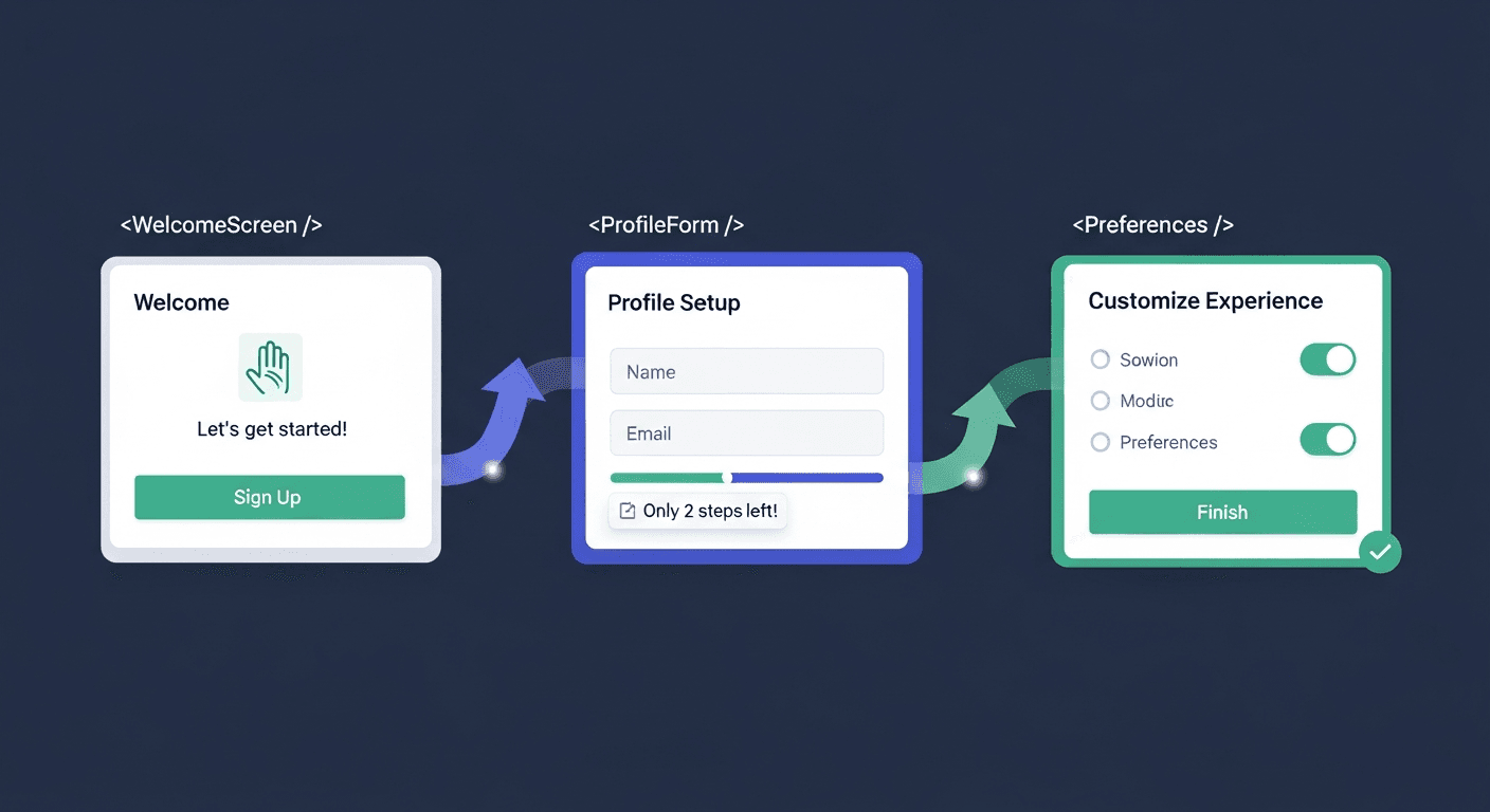
They’re the small moments where the site does something that makes a user feel like someone cared. A button that scales slightly on hover and shifts color, with a subtle shadow change. A page that loads with sections staggering in rather than appearing all at once. An icon that animates when it enters the viewport. Individually these are tiny. Collectively they create a texture of quality that the brain registers as premium.
Where to hunt for micro-interaction opportunities
Buttons: Do they respond to hover with a change in color, scale, or shadow? Does the active/pressed state feel tactile?
Page load: Does content enter the viewport with a graceful animation or does it just pop into existence?
Scroll: Do sections reveal as the user scrolls, or is everything already visible on load?
Navigation: Does the mobile menu animate open? Does the nav adapt on scroll?
Forms: Do inputs show a focus glow? Does the submit button give feedback on loading state?
Links: Do they respond to hover in a way that confirms interactivity?
The ending matters more than you think
The peak-end rule also means the ending of your page is disproportionately important. The final section and the footer are the last things a visitor experiences before they make a decision — stay, leave, or convert. A CTA section that feels like an afterthought undermines everything that came before it. The ending should feel intentional, warm, and conclusive.
Most websites end with a weak footer. The pages that convert best end with a section that re-states the value proposition, reduces the friction to act, and closes on an emotional note that resonates with why the visitor came in the first place.
Applying the Framework
Before shipping any page, run this three-question audit:
Halo Check: Look at the hero for exactly three seconds and then look away. What feeling did you have? Is that the feeling you intended? If you’re not sure, it’s probably not clear enough. The halo has to be unmistakable.
Cognitive Load Check: Can anything be removed? Close your eyes, open the page, and note where your eye goes first. If it’s not where you intended, the hierarchy is wrong. Ask “what can I cut?” before you ask “what can I add?”
Peak-End Check: Are there at least two or three moments in the page where something delights — a micro-interaction, a beautiful visual, an unexpected detail? Does the page end with a section that feels conclusive and motivating rather than trailing off?
These aren’t design rules. They’re descriptions of how human memory and perception actually work. A website that’s engineered around them doesn’t just look better — it’s remembered better, trusted more, and converts at a higher rate. The psychology isn’t a shortcut. It’s the foundation.